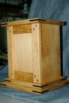
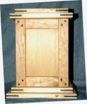
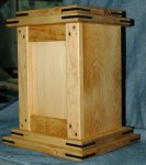
Building the urn - Design A - Redux

Rennie,
to my eye the top with the bevel and the bottom with the round over don't look right together I just can't suggest a way to fix it if you bevel the bottom then the sides would have to be beveled to fit right. If you did a round over on to it would be to heavy. hmmmm:huh:
Yep - same issue I was having. any heavier on the top looks disproportionate in the other direction. A dilemma.:dunno: I thought about a chamfer on the bottom.:huh:

Since you asked....

I think the thickness of the top and bottom are disproportionate with the fingers. And I can't say if those need to be thicker or there need to be more (and narrower) fingers.

This is a particular style cherished by some, but do you think it mainstream enough to sell many? No problem with the price, but as a pastor and having to council those grieving the loss of a loved one, I know there is always much discussion on what the deceased would have liked. Or are you also considering some 'traditional' styles as a supplier of urns?
Two votes for disproportionate top and bottom - excellent guidance - thanks.

This is the first design in what I hope will be a line of 8 or 10. I chose this particular design (Greene & Greene influence) because the funeral home that has agreed to display my work has nothing else like it on the shelf and I wanted to differentiate from the one other local craftsman (simple dovetailed boxes) and the 'made-in-China' heavily-lacquered mitered corner boxes. I may have two models of this box - one with and inlaid ebony cross and one without.

Everyone else - Any other suggestions on the top/bottom controversy?:wave:
 
Well, just a couple of ideas, Take them for what they are worth, probably not much...

I'd go with maybe at least 1, maybe two more smaller fingers?

As far as the lid goes, maybe a banding with a contrasting colored wood? Not so much frame and panel, but just an accent around the edge?

Size looks good, but the fingers just look a little out of scale to me.
 
Rennie, your craftsmanship is excellent. But I agree with Don and Carol about proportions / shapes. To my eye, the bottom is too thin, and the overhang on the top is too long on the ends. Some suggestions -
try using golden ratios to compose the details - if the top finger is 1 high, then let the overhang be either 0.62, 1, or 1.618.

Same with the thickness of the base.

I haven't looked at enough Greene and Greene to have a good feel for the genre. Perhaps if you look at a bunch of pictures, you'll get an inspiration.

I think this should be a great endeavor for you, and I'm sure it'll turn out well.
 
Letting the subconscience work for a while

Design "A" is not in the burn pile - just sitting on a bench where I can see it while I'm in the shop. Still playing with proportions in my head. When something hits me I'll redo it and post here for comments.

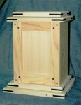
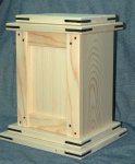
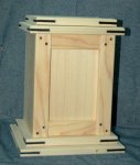
In the mean time, here is another design I'm playing with. Same as before, looking for honest, constructive criticism. Don't be afraid of hurting my feelings as I know there is no one here that would deliberately do so. I take everything offered in the spirit of your willingness to help out a floundering amateur. :D

I have some solid likes and dislikes for this one - but I'll hold off on my thoughts till I've heard yours.
DSC_0007.jpgDSC_0008.jpgDSC_0009.jpgDSC_0010.jpg

Try to imagine this in mahogany with ebony accents. For the rehearsal, Mr Mahogany is being played by Mr. Pine, and Mr. Ebony's understudy, Mr. Sharpie, is playing his part.
 
Basic design looks good Rennie but I agree with a little too much. I like 2 on the bottom and I think 2 can work for the top but the very top piece needs to be smaller:dunno:
 
at first glance it looks to busy for my tastes. I can't put my finger on it but will give it some thought.
:lurk::lurk:

Now that one is starting to grab my eye.

I like the frame detail and the accents of the 'ebony'.
Actually - I forgot to mention that the rails will have a small cloud lift and the panel can be laser engraved with a picture, design, or icon - or it can be made to hold glass for a photograph.

rennie this one says rennie all over it but i feel that the doubled up layers is to much.. maybe two on top or bottom but not both..
I'll play with that idea and see how it looks!

That one looks good but make the base smaller you have to much over hang. How much bigger than the box is the base now. (both parts)????
The bases on the bottom go out in 1/2" steps. The lower top is the same as the inside base and the upper top is the same as the perimeter of the box.:bonkers::bonkers: ...or...
Starting at the bottom (let's call it #1), 2 is 1/2" smaller in both directions than 1. 2 is 1/2" larger in both dimensions than the box. 3 is the same size as 2. An 4 is 1/2" smaller than 3, or the same size as the box.:wave:

Basic design looks good Rennie but I agree with a little too much. I like 2 on the bottom and I think 2 can work for the top but the very top piece needs to be smaller:dunno:
Again - good feedback - I'll play with the design a bit.

Rennie bring the base in on the other one also and then make a top with just a round over and only hangs over not more than 1/2" and see how it looks. Also put a small foot on it.


Just a thought :dunno::dunno:
added to the subconscious list - thanks
 
Last edited:
I like the Mr. Sharpie accents. You could ebonize cherry or oak.

Anyway, here are my ideas-

how about if the top piece is the bigger of the two. maybe with a small cove leading up to it. or just use the bigger of the two, and leave out the one which is the same size as the box.

or

make the top plates 1/2" thick, the bottom ones 3/4", it'll give it some lightness, also keep the above suggestions with the 1/2" thickness.

Looking good there Rennie.
 
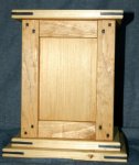
OK - Slapped some stain on it to help tone down the "busy" aspect. I also took 2 shots without one of the top pieces to address some of the suggestions.

Any better?
DSC_0007.jpgDSC_0008.jpgDSC_0009.jpgDSC_0010.jpg
 
Top