Media Cabinet - Cherry

I realized I have not commented on this thread as of yet, my appologies as this thread deserves comments. Love the design, love the wood, especially utilizing sap wood, I love incorporating sap wood in design and from what you have shown, your usage it spot on:thumb: Nice project Glenn:)
 
Not to rub it in, but I am planning a personal and up close look myself. It will be as beautiful as his past pieces.

And as a teaser, Glenn has agreed to contribute to the book in the area of approaching a project and what he considers as he goes. Good craftsmanship is a given, but the organization and thought process is key to really good work done well. He has another project processing in his mind and I will record how this plays out. Will make a very interesting chapter.
 
I can hardly stand to wait until I can see it in "person."

A picture may be worth a thousand words---However, a good look is worth a heck of a lot of pictures.

I enjoyed this thread trip. I will enjoy seeing the real thing.

After that statement do I dare sign off

Enjoy,
JimB?
 
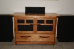
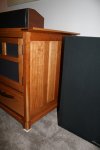
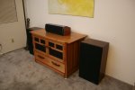
In place pics as promised. I had to clear the wall this was built for so it sort of looks like I just moved in or am just moving out but, the rest of the furniture gets to move back in tomorrow :)

Media Cabinet (172).jpgMedia Cabinet (173).jpgMedia Cabinet (175).jpgMedia Cabinet (174).jpgMedia Cabinet (176).jpgMedia Cabinet (177).jpg
 
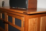
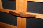
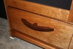
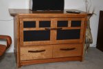
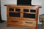
Glenn thats really looking good. Quiet amazing how your edge treatment on the top makes such a huge impact to the overall look. Shows detail matters. You got just the right amount imho. Thinning that edge out just adds style. The piece has a nice touch of Asian design influence in it. Just love those handles.

As to other considerations...dont think speakers look great next to it or the distracting white pieces under the base ;) Knock on effect of new furniture is new other things to go with it. Lol.

Sent from my SGH-I337M using Tapatalk
 
Looks to me like Glenn designed the panels to match the speakers. Well done!

Glenn thats really looking good. Quiet amazing how your edge treatment on the top makes such a huge impact to the overall look. Shows detail matters. You got just the right amount imho. Thinning that edge out just adds style. The piece has a nice touch of Asian design influence in it. Just love those handles.

As to other considerations...dont think speakers look great next to it or the distracting white pieces under the base ;) Knock on effect of new furniture is new other things to go with it. Lol.

Thanks guys. The speakers are crowding it and this bugs me too, visually. I didn't remember them being so dark (or so big) but, they are some of the original Polk's from the early 80's; maybe its time for an update :eek:. I will need to keep playing with position. The little white things under the feet are spike pads. These are temporary so it won't bury itself in the carpet till I get happy with a final position.

Here we go. A challenge for me taking pictures of this kind of item is that the chatoyancy makes the colors shift based on angle and light.

Media Cabinet (178).jpg . Media Cabinet (179).jpg
 
Last edited:
Thanks guys. The speakers are crowding it and this bugs me too, visually. I didn't remember them being so dark (or so big) but, they are some of the original Polk's from the early 80's; maybe its time for an update :eek:. I will need to keep playing with position. The little white things under the feet are spike pads. These are temporary so it won't bury itself in the carpet till I get happy with a final position.

The new cabinet looks great Glenn! :thumb:Maybe it's time to rebuild speakers in the same style as the cabinet?? :dunno:
 
Top