Chas Jones
Member
- Messages
- 951
- Location
- Cotswolds, UK
______
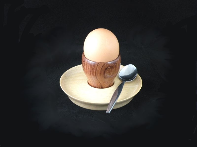
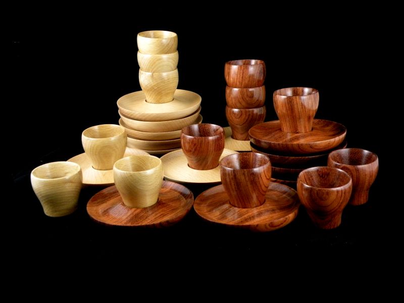
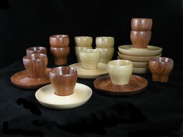
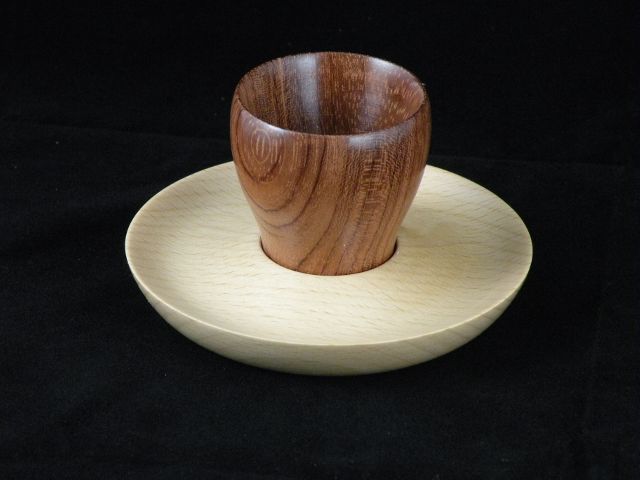
________A follow on from the "Breakfast Companions" thread..____Click on images for larger view.
________
________There are however local differences in preference for colour of wood
________or more correctly combination or otherwise of woods.
________I would be interested if there is an overriding forum member preference .
______
________
________
________Comments on members preferences would be appreciated.
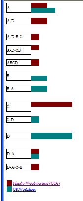
_____A_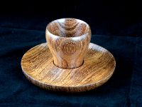 _____B_
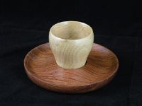
_____C_ _____D_
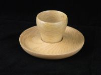
_______As a matter of interest all the dark wood is the same colour, just my photography that is off.
________A follow on from the "Breakfast Companions" thread..____Click on images for larger view.
________
________There are however local differences in preference for colour of wood
________or more correctly combination or otherwise of woods.
________I would be interested if there is an overriding forum member preference .
______
________
________
________Comments on members preferences would be appreciated.
_____A_
 _____B_
_____C_
 _____D_
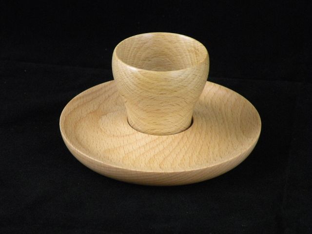
_______As a matter of interest all the dark wood is the same colour, just my photography that is off.
")