New Bedford Historic District Sign

Leo Voisine

Member
Messages
5,728
Location
East Freeetown, Massachusetts
I will be working on 2 signs simultaneously.

This sign and The Ark will be on going at the same time. That is what I get for procrastinating.

I went and measured EVERYthing on the storefront but I lost all the numbers - MAN - what a bummer that is.

I need to go back and get at least some basic numbers for size.

Sample-1.jpgSample-2.jpg

These are a couple of sample signs that the customer said they liked.
I will design around this, and also "fit" the Design to a New Bedford Whaling historic look.
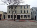
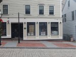
store-1.jpgstore-2.jpg

The sign will be hanging above the 3 windows on the right side of the building.
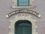


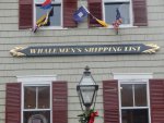
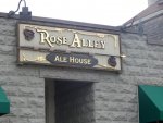
Candleworks.jpgmariner home.jpgwhale.jpgDartmouth Historical.jpgRose Alley.jpg

This is just a little flavor of the rest of the neighborhood.

There are others also but I need to fit in with the area.

So in designing a sign - we need to consider the context the sign needs to fit into.
 
NB Historic - update 1

OK - so this one will be slower cause I have not done the design work yet.

I lost all my dimensions so I needed to go to the storefront and remeasure.

The customer has work going in inside the store buy was not there at the time I was there.

1792 plaque.jpg

This is the plaque on the front of the building. It was built in 1792 - earlier than I thought.


layout-1.jpg

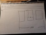
The space above the windows is limited. The flat trim board just below the crown is 4-1/2. The next flat down is 9" and the lowest flat is 8-1/2

Across the 3 windows is 198 inches


layout-2.jpg

I need to be sure I clear these light fixtures.


layout-3.jpg

Nothing Fancy - Just numbers - but I needed them.

OK - maybe it doesn't seem like much - but I needed to do this.

I also needed to make a new spoil board. I just cannot do anything plain. I made the holes and c-bores and gridlines and some pretty text to WOW my visitors. It's all done - just need to Shellac it - I might paint the text and gridlines. I will do all that tomorrow.

More to come.
 
SMALTZ anyone ?

The customer wants gold letters with a black background.

I am going to order the samples bags of Smaltz.

I am thinking the background would look terrific with Smaltz.

http://www.artisan-signs.net/SmaltsForSigns.php


Smaltz Background.jpg

It is not cheap $22 per sq/ft

Looks like the sign is going to be ~ ABOUT ~ 16 sq-ft

But it does attract attention - and THAT is what a sign is supposed to do. :D
 
Last edited:
Design Concept - 1

So,

I am painting my spoil board and while waiting for the paint to dry - I am working on this design.

Design screen-3.jpg

This is the first round of design concept. Much of what I do here will get used on other concepts. In fact I have several components inside this file on layers - but the other layers are just shut off.

I have imported models and bought the fonts from Letterheads . com It is called Old Tom.

Once I have a basic design I converted the text to curves then grouped the text. Like the "O" has an inside shape and an outside shape. Grouping those two vectors will make them as though they are one component.

Design screen-1.jpg

ONE at a time - I create an individual model out of each letter. After creating the model I can edit the properties and give it a color.


Design screen-2.jpg

After creating the model I can edit the properties and give it a color.

With the split screen I can work in the 2D view and see the result in the 3D view.

It's a little tedious - but the sale pays the bill.

Design screen-4.jpg

This is how it looks as I go through the individual letters.
 
OK - this is the first Concept

I have a few variations.

Sailboat - Anchor - Ships Wheel

decorations or no

Gold Border or black

Concept-1A.jpgConcept-1B.jpgConcept-1C.jpg

I will get a couple more concepts going - then show the customer.

I will put it together in a nice folder all printed on 8x10 photo paper.

I order some samples of Smaltz - so I will show that as well as the photo of a sign with a smaltz background.

Sooo - this is round one.
 
That is such a clean, easily read, sign. Will the Smaltz detract and/or make the sign more difficult to read? How easy is it going to be to keep the background clean and, dare I say, "vibrant?" The contrast on the computer is GREAT. However, in the real world, Mother Nature has a lot to say about how easily the sign can be read in a few years.

Since I know nothing about making signs I am sure I am asking some dumb, elementary questions. This sign looks "quality" and is probably expensive. It does not look like something you would want to replace very often.

How far away are the people you want to be able to read the sign? I assume pedestrians will be fairly close. Are some of the viewers in cars or across a courtyard? You can compute how far away a person can read the sign.

Eye test letters always fit into a square. Take the letter "E" as the design element. A person with 20/20 can easily read the sign if the thickness of the letter and the space between the "ink" part of the letter, each, subtend 1 minute of arc from where the person is standing. Thus our test letter E has a size that subtends a total of 5 minutes of arc (3 bars and 2 spaces).

In California you can pass the driving vision test with 20/40 visual acuity. 20/40 means you can get almost all of the letters correct on a chart 20' away, however a person with 20/20 could do the same from 40' away. (20/200 is legally blind)

Anything that is done to make the sign more artistic or anything to reduce the contrast between the letter and the background means that the person has to get closer or the sign has to be larger.

OK I will shut up now.

Enjoy,
JimB

Well, no, I won't shut up. I have to add that I really like your sign.
 
I don't know anything about signs, except what looks right to my eye. I like the arch of "New Bedford" but would prefer to see it centered, along with the words and graphics on the second line. The ship looks too big to me. Perhaps make the ship smaller and balance it with an anchor or other appropriate graphic on the other end.

Smaltz looks interesting! That should look good on the field of the sign.
 
I like the comments. It help me "see" the sign.

As to the Smaltz - yes it will be fine - it is used on lots of signs - just not on cheap signs.

One thing I do is look at every sign I see.

Some people can walk down a street and not really see the signs.

I walk down a street and I see EVERY sign. I study them.

There actually is a formula for the size of the text and the distance away. I don't remember it off hand. The text here is as big as I can make it.

I also do need to give the customer what they ask for.

ALSO - this is Concept #1 - NOT - the final design. The customer in the end will decide. It is my job to create a vision for the customer. They normally cannot see the picture without visual aids. Making the sign is just part of the process. Helping the customer SEE - is the other part.

Honestly - I am pretty certain the customer will not like the sailboat at all.

I will have maybe 3-5 concepts before deciding on a final design.

In the end - I will add to my library of ideas.
 
I don't know anything about signs, except what looks right to my eye. I like the arch of "New Bedford" but would prefer to see it centered, along with the words and graphics on the second line. The ship looks too big to me. Perhaps make the ship smaller and balance it with an anchor or other appropriate graphic on the other end.

Smaltz looks interesting! That should look good on the field of the sign.

Having the graphic element (ship in this case) on the right brings the focus of the sign closer to the door, and center of the building. You have to look at a sign in context, not as a stand-alone.
 
Concept - 2

I did concept #2

It's NOT about what I like - but rather what the customer likes.

All I can to is to present thoughts and ideas.

I will give the customer the option to pick and choose the components - then I will compile them the way they want it.

So here is some Concept #2

Concept-2C.jpg

Concept-2B.jpg

Concept-2A.jpg

Concept-2D.jpg

Concept-2E.jpg

Concept-2F.jpg

Concept-2G.jpg
 
I don't know anything about signs, except what looks right to my eye. I like the arch of "New Bedford" but would prefer to see it centered, along with the words and graphics on the second line. The ship looks too big to me. Perhaps make the ship smaller and balance it with an anchor or other appropriate graphic on the other end.

I'm sorry but I'm cancelling Bill's vote. It is a casual area. So I really like the letters off center. This also means that I like the size of the ship for visual balance.

The "ship" does not have to be a ship (though that really sounds appropriate for the area), just something appropriate to the area or, perhaps, to something common in tattooing.
Go to the drug store or Walmart and get a cheap pair of reading glasses---choose a pair that give a definite blur. Use them to look at your signs on the computer, so you just see the design element and not the detail.

Re design test #2: To me that red, or a much darker red, would have a good feel for the area. However, I prefer the black slightly. In general red paints have a propensity to fade; this might be a maintenance factor.

You are doing great Leo.

Enjoy,
JimB
 
Last edited:
I do the colors to get a visual on something different. I was told they want black with gold.

I am sure it will be black, but I present it anyway.

I need a couple more concepts. The are the sign will go into is 96" x 22.25"

I can use the entire 96 inches - even more - but that is more than the 8' HDU sheet

I have the area of 22.25 BUT - I don't think filling that entire space is really a good idea.

The Red background I was thinking of is a dark cranberry. This is a cranberry growing area.

The REAL focus of attention is --- TATTOO - Whaling, fishing -

It needs to be within the bounds of the New Bedford Historical Preservation Society.

I do have more thoughts in my head - just need to get them down on paper - gonna work on another one tonight
 
I'm sorry but I'm cancelling Bill's vote.

Hey, Mr. B, my vote gets cancelled several times a day, so have at it!!! :bow:


It is a casual area. So I really like the letters off center. This also means that I like the size of the ship for visual balance. ...

Now, what do you know about vision, anyway??? Oh.....yeah.....:hide:


Seriously, I get what you mean about balance. What will work best is that which fits into the typical style of the area. Oh, yeah...that and what the customer wants!!!
 
Top