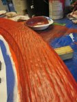
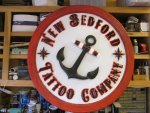
New Bedford Historic District Sign

... makes me think of 'anchor'.

The Anchor is Coming - don't you worry about that.
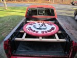
delivery-1.jpga-sign-3.jpgPost-3.jpg

This sign is 4' in diameter

I designed the outer rim so that I can make a ships wheel some day.

I designed the anchor. I make it in two halves and bolted it to the sign.

So - THAT - anchor is what will be coming - but on a different format.

I also designed the compass rose stars.

It has been hanging on the north end store for 2 years.
 
Given you have an ability to digitally create any image in this sign for the signs purposes why not do a tatoo?

I dont see how a sailing vesel in gold relates to a tatoo parlor regardless of where the store is located. I would expect that to be a sailing supplys store for ropes and shackles etc.
If the sign is going to have an image then the words will not get read only the image will be interpreted as to what the store is offering.
The image in my view should speak to the store offering. Different if it was an established brand with iconic logo.
I would look up to see what the most popular tatoo is and use an image like that. Say a heart with a rose vine or something that inspires the customer as to the capability of the store.
Not some spagetti western solution to a design by comittee sign.
This to me is the difference in hiring a qualified sign creator/maker as opposed to a maker of signs.
The value add is presenting a solution of value to the client which involves creativity relevant to their business and is going to leave a memorable lasting impression. For this to happen the sign needs to move the viewer. Not just inform.
I realise there may be restrictions from the village but i would be looking to push the limits of the envelope not be mediocre.
Sorry just my 5 cents. If the historic village is so concerned about appearance then perhaps they should not be leasing to a tatoo parlor. If they want the lease to work they need to allow the neccessary signage for the store to suceed or they going to be finding a new lessor sooner than the paint dries on the sign.

Sent from my SGH-I337M using Tapatalk
 
I can see what you're saying Rob, would you really know what type of store it is if you were far enough away to not be able to read it and have it draw you in. Sounds like the client has an idea of what they are wanting in this case. It may also be the case that the shop has enough clientele and business from word of mouth to sustain too, much like many artists do. Don't think that the advise is falling on deaf ears, a very good point to consider in design work. :thumb:
 
Given you have an ability to digitally create any image in this sign for the signs purposes why not do a tatoo?

I dont see how a sailing vesel in gold relates to a tatoo parlor regardless of where the store is located. I would expect that to be a sailing supplys store for ropes and shackles etc.
If the sign is going to have an image then the words will not get read only the image will be interpreted as to what the store is offering.
The image in my view should speak to the store offering. Different if it was an established brand with iconic logo.
I would look up to see what the most popular tatoo is and use an image like that. Say a heart with a rose vine or something that inspires the customer as to the capability of the store.
Not some spagetti western solution to a design by comittee sign.
This to me is the difference in hiring a qualified sign creator/maker as opposed to a maker of signs.
The value add is presenting a solution of value to the client which involves creativity relevant to their business and is going to leave a memorable lasting impression. For this to happen the sign needs to move the viewer. Not just inform.
I realise there may be restrictions from the village but i would be looking to push the limits of the envelope not be mediocre.
Sorry just my 5 cents. If the historic village is so concerned about appearance then perhaps they should not be leasing to a tatoo parlor. If they want the lease to work they need to allow the neccessary signage for the store to suceed or they going to be finding a new lessor sooner than the paint dries on the sign.

Sent from my SGH-I337M using Tapatalk
'

ROB - YES - Of Course.

I learned that with the sign makers but I forgot.

I absolutely NEED to focus FIRST on a Tattoo company and SECOND - on the historical nature of the setting.

I know what the customer wants, but getting it into a design is not all that easy. I am not really an artist, though I do have some ability in that arena.

This is certainly a marketing strategy and your knowledge and experience is spot on.

My next version will be more focused

Thank you for the comments - that is steering me in the direction I need to go.
 
Been a while since my last post on this one.

Rob - thank you - you were point on - glad you woke me up.

Here is where we are at.


Concept-4B.jpg

My customer loves this one
They asked if I could do a red shadow behind the text.


Concept-4B2.jpg

I am thinking - just behind the TATTOO


Concept-4B3.jpg

But they can also have it behind the New Bedford if they want.

I will be doing the Smaltz (Osmaltzo) also

We are in the final negotiations on design.

We have finished the financials

They need to get approval from the city historic district now.

In order to be able to make this sign I needed to do some work to my machine cabinet to allow the feed through and tiling. I also upgraded some other stuff I wanted to have. I'll be posting about that stuff also.

So - how do you like the final design?
 

Attachments

  • Concept-4B.jpg
    Concept-4B.jpg
    52 KB · Views: 17
Yeah! I like that #4. The eye doc in me says, "Neat, clean, easy to see and discern what you want to know."

Rob, as usual, is right. I got carried away in the location instead of the source of income. This is better cheese for the mouse trap and it still works very well for the location.

Enjoy,
JimB

ps This has been fun.
 
Gonna Get this going now

I have ordered and recieved the gold paint

I ordered heavy duty "Z" channel for mounting - similar to a french cleat.

Tomorrow I will order the Black Glass Osmalto - for the textured background

I bought way more HDU than I need.

One thing about a job like this is that it pays for me to stock my supply shed.

I bought 4'x8' x 2" thick 18 pound SignFoam4 HDU

I bought 4'x8' x 1.5" thick 18 pound SignFoam4 HDU

I bought 4'x8' x 1/4" thick Alumalite panel

Price tag on the HDU and Alumalite - $1018.00

This is one reason I do this - cause I cannot afford the stuff I like to play with - besides it's a blast making the sign anyway.

HDU-1.jpgHDU-2.jpg

I have the go ahead - and they want it July 20, 2015

It's gonna take me longer than that to make it.

Now I have 2 projects on my plate.

HOW do they say it

I have a long way to go and a short time to get there.

OKKKK - so here we gooooooooooo
 
Not forgotten,

I have been extremely busy last couple of weeks.

The New Bedford Sign had 48 seperate tool path programs that needed to be run.
Have run 85% of the toolpaths at this time.
What an Adventure.
LOTS of learning - for me.
LOTS of new stuff for me.

I have cut out all three hummingbird plaques and they are in process.

I had to change a starter in my Ford and do brakes.

My riding mower needed repairs

My son's wife gave birth to their 3-rd in CT and we went down there for a visit.

I took my wife and granddaughter out on a Whale watch on Stelwagen bank

There has just been no time for video editing or picture updates

BUT - I WILL - bring this back on track
 
Top